Why It’s Just Plain Wrong To Destroy Identity Symbols
Aug 05, 2022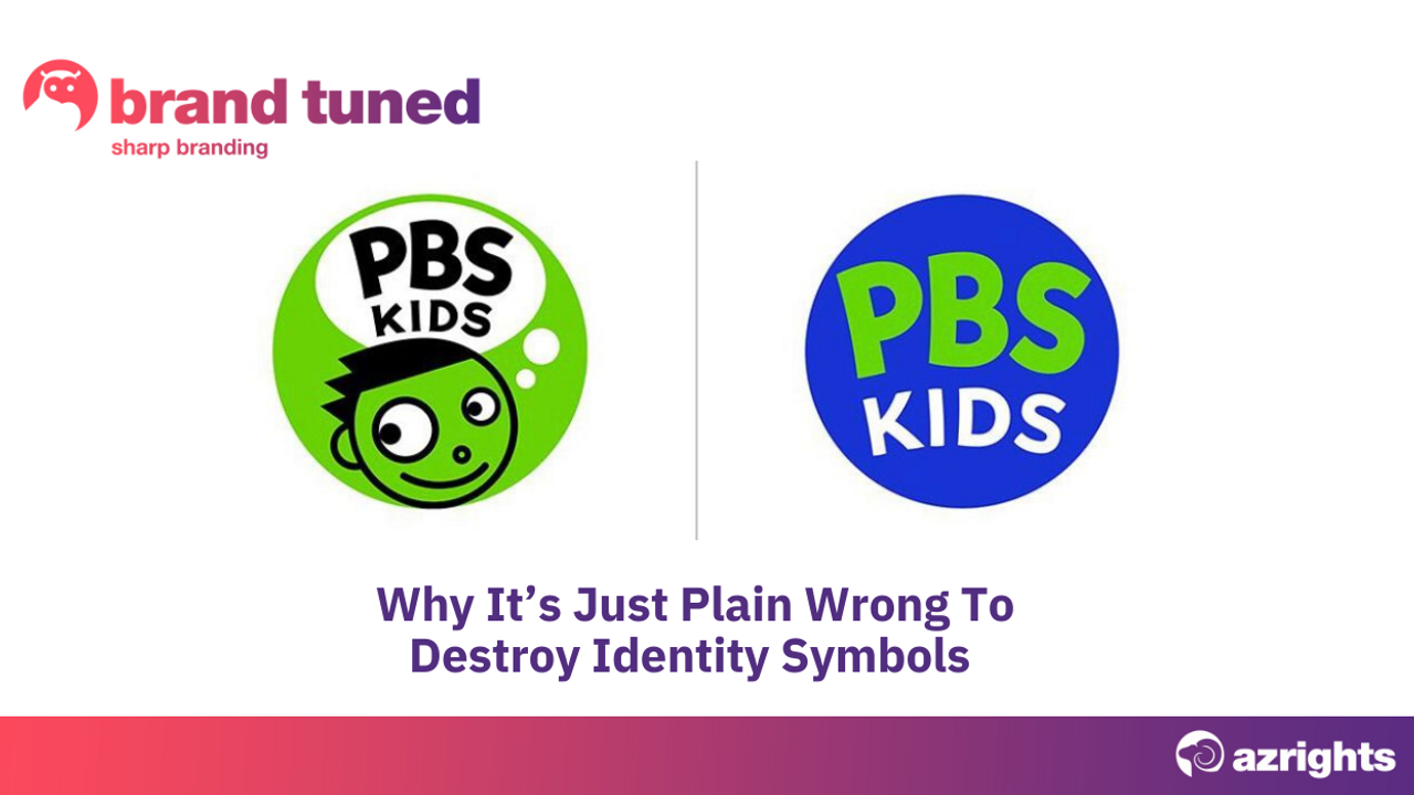
I am surprised that so few of the branding courses I attended discussed distinctiveness.
Although some were curated by designers, they said next to nothing about the role of visual designs in ensuring you are noticed, remembered, and bought. The accent was almost exclusively on differentiation and business models. Indeed, many designers and marketers believe differentiation and distinctiveness mean the same thing. But the two terms are not synonyms. They call for entirely different actions.
When you’re making a brand distinctive, you’re focused on identity. It’s all about intellectual property: choosing a distinctive name, tagline, logo, visual symbol, colour palette or sounds and even smells. Your identifiers are generally legally protectable as trademarks, provided you’ve made good choices. Some identifiers may not be protectable immediately, so you need a long-term strategy to own them. The brand name and identifiers are what contain a brand’s value.
If you think about it you’ll soon realise that it’s these distinctive elements that people remember when they recall well-known brands.
Distinctiveness is what makes a brand unique and inimitable long-term. Once you have a well-known name and distinctive brand identifiers, you would not discard them for trivial reasons. They are assets that contain the brand’s value, after all.
I would expect designers to respect these brand identifiers. After all, designers are supposed to understand the visual world. Yet the graphic designers I have come across when seeking support for my own business have tended to be all too ready to discard existing brand identifiers and to want to create a new name and identifiers.
Cases like the Tropicana redesign show the general lack of attention to preserving existing assets that prevails in the design industry. The fact that radically changing a business’ look and feel would make a brand more difficult to recognise doesn’t seem to influence design decisions.
The recent change of visual identity by PBS Kids, which went from using a well-known face visual to an icon that simply spells out the words PBS KIDS is a case in point.
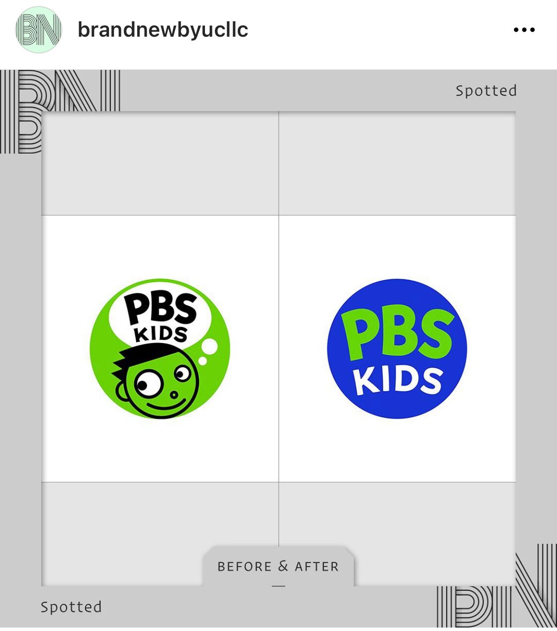
The agency supposedly tested the change and verified that the new logo was well received. I have my doubts how good those tests were. In any event, making such a change demonstrates a complete lack of regard for identity, distinctiveness, and intellectual property. There is little appreciation that this change will result in a loss of brand value.
Apparently, the reason for the change was to have something more legible on small screens. There was also some misguided notion that it would advance diversity and inclusion to scrap the visual. Someone is clearly using diversity and inclusion to overstep their role because there is nothing inherently wrong with the visual for it to raise such issues.
As to the objective of having something legible on small screens, it would have been much better to increase the size of the letters spelling out PBS by discarding the word KIDS. Why on earth discard a powerful asset like the visual in favour of 3 meaningless letters of the alphabet?
This is a prime example of the tendency of some designers to scrap what came before and start with a blank slate. It’s the approach I’ve personally experienced time and time again when I’ve hired designers. The mindset is that as much change as possible is desirable. Rarely is the attitude one of building on what exists.
The PBS visual was so distinctive and well known that even without seeing the letters people recognised that it emanated from PBS. This is one of the objectives of branding – to be recognised by a visual like the Coca Cola bottle, or the Nike Swoosh, or by your logo alone unaccompanied by the name, as Mastercard has achieved. Who could believe that it’s a good idea to scrap something iconic that has become well recognised in the market?
Designers should know better than to throw out a strong brand asset like this in the name of legibility on small screens. They should be mindful of the dangers of disrupting consumers’ memory structures. Indeed, if a client asks them to make such a change, I’d argue that their role is to help the client to understand why they should think long and hard before doing so.
Maybe the fact that brand strategy courses don’t teach designers how to approach identity design has something to do with their tendency to want to start with a clean slate.
The heart of branding is identity. Anyone involved in brand creation needs a training in identity. This involves understanding intellectual property and the legal concept of distinctiveness. An awareness of Daniel Kahneman’s Thinking Fast and Slow and decision science should be part and parcel of how to approach visual identity design. I want to see a world in which designers put their creativity to better use so that instead of destroying and rebuilding brand assets they preserve and build on what already exists and works.
That’s one reason I created the Brand Tuned Accreditation program. It includes several hours’ of content on distinctiveness and identity. Yet I could create an entire standalone course just on identity and distinctiveness. There’s so much to say on the subject. I’m amazed that branding courses say so little about identity.
So, if you want to plug the gap in your knowledge of intellectual property and to learn how to create brands that are distinctive, as well as differentiated, sign up for the Brand Tuned program which starts 8 September.
